No products selected.

 DW Extensions
- Car Rental System
- Survey Manager
- Maps Inserter for Google Maps
- Advanced Form to Email PHP
- Advanced Form to Email ASP
- Posts Carousel
- Comments Inserter Widget for Facebook
- Mobile Optimize
- Photoshow
- Smart List
- Light Date Picker Calendar
- Touch OnOff
- Touch Button
- Light Edit
- Advanced Form to Excel PHP
- Text Tools
- Advanced Database Relational List
 Free Tools
 Another Resources
 Product Info
Demo / Video / Faq
 Instant Download

Paypal: You will return from Paypal to a direct download page. A copy of your personal donwload link will be sent to the email address used for payment.
Be sure to check also your spam/bulk mail folder.
Mobile Optimize
Recently, mobile devices have experienced a fast development, and so did data networks for these devices. This development has led to a substantial increase in the amount of people using their mobile devices for browsing the Internet. Statistics show that the number of users of smartphones such as iPhone, Blackberry, Palm, and cellphones based on Android and Symbian operating systems, has increased the consumption, from these devices, of services and information published on the networks.
Websites have had a slightly different development: most websites have existed for several years and are not optimized for display on devices with tiny screens such as mobile phones. Because of its complexity, the cost of modifying all these websites is extremely expensive for their owners and webmasters, if we take into account that not all devices support HTML standards equally.
Mobile-Optimize is a more economical solution and it is adaptable to a variety of websites: a tool capable of transforming the structure of a website to increase its adaptation to smaller spaces such as the mobile devices' screens. With Mobile-Optimize, web site owners can extend their web presence to include the constantly increasing number of mobile device users. There are many mobile devices that only show a very small set of HTML tags; for these devices Mobile-Optimize displays web pages through a mobile service offered by http://www.google.com/gwt/n.
FEATURES
Mobile-Optimize's features include:
- It is an unexpensive solution to a complex problem;
- It is extremely easy to use. Users can take advantage of this tool with only a basic knowledge about the web;
- Minimize the web page's loading time. The mobile data networks have not yet reached sufficiently high speeds, so each optimized byte of information is important and the necessary connections on a webpage must be reduced;
- Users have a large number of setup options that ensure full adaptation of Mobile-Optimize to all kinds of websites;
- After processing, it stores webpages displayed to avoid web server overload;
- It is an extension for Adobe Dreamweaver, which makes the insertion into a website quite simple, making the whole process completely visual.
DEMO
REQUIREMENTS
- Mobile-Optimize is an extension for Adobe Dreamweaver MX or later versions, including CS3, CS4, CS5, CS6, CC...
- Mobile-Optimize requires PHP 5 script on your web server.
INSTALLATION
The installation process of Mobile-Optimize is similar to the installation of other extensions for Adobe Dreamweaver. Just run the Adobe Extension Manager, which is distributed together with Adobe Dreamweaver, select the option "Install Extension" and insert the path to the downloaded .mxp file.
Once installed, the Mobile-Optimize extension can be accessed from the Commands menu in Adobe Dreamweaver:
Use
To insert Mobile-Optimize into your website, just follow the steps below:
- Run the Adobe Dreamweaver;
- Open the webpage where you wish to insert the Mobile Optimize tool, for editing in Dreamweaver;
- Run the menu option "Commands > Insert Mobile Optimize", in Dreamweaver. A setup window will be displayed and must be completed in order to obtain best results;
- Save the changes to your website. Mobile-Optimize creates a folder named "mobile" in the root of your website with the code required by the tool.
Notes
If you want to store processed webpages to reduce the load on the web server, it is necessary to set the permissions on the "cache" folder inside the "mobile" folder. You must to set permissions for writing in the "tmp" folder too. The "tmp" folder is used to save the CURL session files.
Amongst the Mobile-Optimize's setup options there is the possibility to display the optimized page automatically whenever it is accessed from a mobile device. This option is valid only for the Apache web servers. If your hosting provider does not offer an Apache web server, or you do not want the webpage processing to be done automatically, then you need to insert Mobile Optimize in each of the pages to be visited by mobile devices.
Description of the setup window
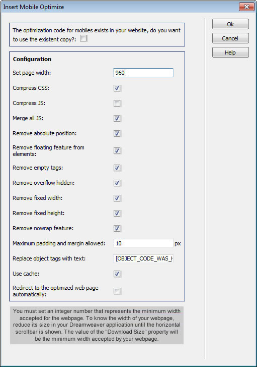
Use existent copy: Allows you to insert the Mobile-Optimize tool into the rest of the web pages with the same values previously set up for the website. If you change the settings for the new configuration will affect the entire website.
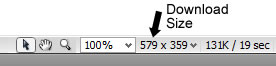
Set page width: Enter the minimum width allowed for the correct viewing of your webpage. Some mobile devices such as the iPhone and the iPod, scale down a web page before displaying it. By default, these devices take the width of a web page as 960px, but the best results are obtained when you enter the actual value of the minimum width allowed by your website. The way to determine the approximate minimum width of a webpage is simple:
- Open your web page in Adobe Dreamweaver;
- Reduce the width of the application until the horizontal scroll bar is about to be shown;
- The value displayed in Dreamweaver under "Download Size" is equivalent to the minimum width of your website.
Compress CSS: Mobile-Optimize reduces CSS files' contents before sending it to the browser by removing redundant line breaks and spaces, and combining related styles as well as classes with similar styles. CSS files are compacted before being sent to the browser. Data networks on mobile devices are still not quick enough so that every spared byte is appreciated.
Compress JS: Mobile-Optimize reduces the content of JS files, files with javascript code, before sending them to the browser, by removing redundant line breaks and spaces. To use this feature, the JS code must be totally correct, respecting the semicolons at the end of each line, as well as the keys that delimit code sections, or else javascript errors could be generated . JS files are compacted before being sent to the browser.
Merge all JS: All the Javascript code that exists on the webpage, including that of the javascript files present on the webpage, are mixed and placed into the web page content before the </ body> tag. Whenever the browser comes across a reference to a JS file from the web page, it pauses the downloading process of the rest of the content until the javascript file is downloaded in its entirety. The number of possible connections from a mobile device browser is limited, and so is the speed of data networks; this option reduces the number of connections required by the website thereby increasing the speed of web page download.
Remove absolute position: The property
Remove floating feature from elements: The property
Remove empty tags: Such labels as <div>, <span>, <p>, etc.. without content, are removed in order to reduce the HTML of the website. If you use empty <div> labels in order to insert dynamic content, then you will need to keep this option unchecked.
Remove overflow hidden: The property
Remove fixed width: If any of the website elements has a fixed width, it will be removed to facilitate adjustment of the web page to the width of mobile devices' screens. Quite often fixed width is used to prevent repeating of a background image; to obtain the same result, it is more appropriate to use styles created for this purpose.
Remove fixed height: If any of the website elements has a fixed height, it will be removed to facilitate adjustment of the web page to mobile devices' screens. Quite often fixed height is used to prevent repeating of a background image; to obtain the same result, it is more appropriate to use styles created for this purpose.
Remove nowrap feature: The property
Maximum padding and marging allowed: Margins or padding greater than the integer entered in this field will be reduced to this number.
Replace object tags with text: Some items that are not part of the HTML standard, such as SWF objects as well as APPLET, are not supported by some mobile devices. If you enter text in this field, all such items on your webpage will be replaced by the text.
Use cache: Allows you to store web pages after processing, greatly reducing download time and avoiding server overload, when the same webpage is requested again. To use the cache it is necessary to grant writing permissions to the
Redirect to the optimized web page automatically: The webpage can be automatically redirected to its optimized version when accessed from a mobile device. Such redirection is only possible if the website is hosted on an Apache web server and "mod_rewrite" module is enabled.
Instant Download
$49.99
Paypal: You will return from Paypal to a direct download page. A copy of your personal donwload link will be sent to the email address used for payment.
Be sure to check also your spam/bulk mail folder.